

How to fix viewport width if not set
If you want your web pages to be fully viewable on all devices, setting the width and scaling the viewport with the viewport meta tag is essential. This ensures that the viewport is the appropriate size on all devices, particularly mobile ones. If you do not use the viewport Meta tag, your website could be difficult to see, and it could make pages slow to load on mobile browsers. In addition to being a bad user experience, that affects the first input delay (FID).
So, if your web pages aren’t fitting the screen exactly it’s time to adjust the width. Keep reading for a rundown on how to get the viewport width set correctly.
Why is setting the viewport correctly is important
The screen of a device is the viewport responsible for displaying content when using a web browser. The viewport changes depending on the device. For example, the viewport on a mobile phone will be significantly smaller than the one on a desktop computer screen.
The browser provides instructions via a “meta” viewport element on how to alter the dimensions and scale of the page to fit the screen. Without this tag, your page performance can be affected in the following ways:
Sub-optimal scaling
Without a viewport meta element, your site will be rendered at standard desktop widths before being resized to fit mobile devices. This can cause sub-optimal scaling that makes it difficult for some visitors to read your web pages.
FID enhancement
When viewing content not explicitly created for a mobile device’s display, most mobile browsers allow you to zoom in quickly by double-tapping the screen. A viewport meta tag can prevent this from happening, but without it, mobile browsers will wait up to 300 milliseconds after the initial tap to see if a second tap occurs. This is called first input delay (FID). Your page’s FID will increase by hundreds of milliseconds because the page will be unresponsive to the first tap.
This not only makes things worse for your site’s users but could also hurt your search engine rankings. Fortunately, this issue can be solved by including a specific viewport meta tag, which can significantly enhance your site’s user experience.
How to fix viewport width that isn’t set correctly
Viewport width issues occur because the viewport meta tag either isn’t used or it’s set to a certain width that doesn’t fit all screens. When the viewport meta tag uses a specific width, you run the risk of alienating many current and potential future users if the width isn’t right for their screen. Luckily, there’s code you can use to make the width more versatile.
You can adjust the dimensions of a web page for various devices by providing the code ‘width=device-width’ in place of a specified width number such as “width=600”.
But that’s not where it ends. There’s more than one way to use the ‘width=device-width’ code. The following are some examples:
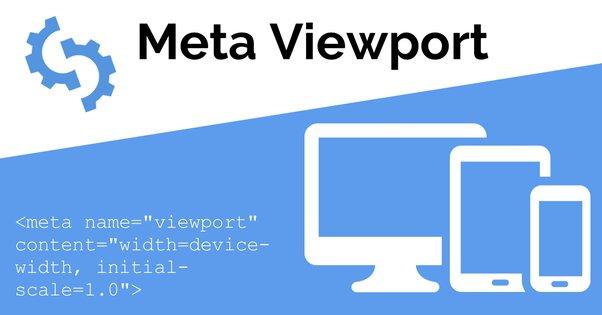
<meta name=”viewport” content=”width=device-width, initial-scale=1″><meta name=”viewport” content=”width=device-width, height=device-height, initial-scale=1.0, user-scalable=yes, maximum-scale=5.0″ /><!–<meta name=”viewport” content=”width=device-width, minimum-scale=1.0,user-scalable=yes”>–>
While this fix is very straightforward, you may want the help of a developer if you plan to do anything beyond the standard ‘width=device-width’ code.
If you’re looking for SEO project management software to better manage your workflow, clients, and business – evisio.co is your solution. Try evisio.co for free here!